Netflix
For my Needs Assessment and Usability Evaluation course (SI 422), my team and I decided to analyze Netflix throughout the semester. Our research included finding needs and values of personalization, privacy, and socialization on entertainment streaming platforms, and we utilized UX Research methods such as interviews, personas, interaction map, card sorting, and usability testing.
Research Objectives
As the entertainment industry is revolutionizing from an in-person walk-in experience to an online streaming on-the-go service, more individuals in the twenty-first century are changing the ways they watch entertainment media. We decided to choose Netflix as our platform of study because of its popularity, as well as the company’s emphasis on recommendation systems and algorithms to deliver value to the user.
PERSONALIZATION
How do users personalize their browsing experiences on Netflix and what features would users like more control of?
SOCIALIZATION
To what extent would a follower economy on Netflix affect what a user decides to watch on Netflix?
FUNCTIONALITY
What design inconsistencies and usability problems arise in regard to Netflix’s user journey?
PERSONALIZATION
How do users personalize their browsing experiences on Netflix and what features would users like more control of?
METHODOLOGY
Although Netflix has a large and diverse user base, most users have the same desire to have more personalized browsing experiences, based on our survey data and user interviews. Besides watching content, users seem to be spending the bulk of their time interacting with the platform to personalize the browsing experience in order to receive better recommendations and save shows/movies for easy access later. Here are some of the UX Methods we used to develop a better scope of the personalization process.

Usability Testing
A usability test allowed us to observe how users actually behave on the platform by conducting the test on an actual product and identifying specific usability issues on the platform. The overarching theme our team found by conducting the usability test is that users are not aware of, or do not fully understand, the features and controls that allow them to personalize their browsing experience. The usability test prompted errors for Netflix’s My List recommendation system, % Match algorithm sorting, and Viewing Activity analytics.
Interaction Map
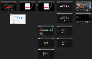
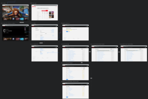
We created an interaction map to outline the user journey of navigating through Netflix’s personalization features (shown at the right). The objective of this map was to find any confusing or unwanted interactions that could improve the personalization process. In particular, we made sure to site how users can manage profiles, find their viewing activity, and add titles to My List. Even though Netflix has a well established website, it’s important to understand how users navigate through the website because Netflix is constantly updating the platform with new features and an interaction map can signal any potential roadblocks for the user that could harm the platform in the long run.
Preference Plan (A/B Testing)
Participants in our usability tests found the Viewing Activity page difficult to navigate to from the Netflix browsing page. When these users finally did arrive at the activity page, most did not recognize the icon for removing titles from their viewing activity. Based on these two insights, we decided to design and test two treatments to the user interface as a Preference (A/B) test. We utilized heat map features on Qualtrics to analyze where users click on the Viewing Activity to best meet their needs.
Card Sorting
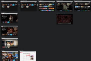
A card sorting event indicated some of the expectations of Netflix users when they access their account and choose content that meets their needs. With these expectations in mind, I wanted to discover which sections of Netflix can be improved and how can better labeling/search enhance the user experience. This procedure utilized an open card sort method that asked participants to organize the content and define categories based on what they felt was most appropriate. This event resulted in a sitemap that highlighted potential features Netflix can fix on the homepage.
SOCIALIZATION
To what extent would a follower economy on Netflix affect what a user decides to watch on Netflix?

METHODOLOGY
One important value in-person entertainment provides that Netflix has struggled to implement is a more social environment. “Going to the movies” is often thought of as a social event, whereas watching Netflix is generally thought of as activity one does by his or herself. Our research is centered around this notion of the relationship between entertainment streaming platforms and social interactions. In observing Spotify, a niche competitor to Netflix, a friend/follower economy is implemented in the online streaming platform so that users can see what their friends and favorite artists are listening to, which in turn influences music selection and preferences. In reflecting on Spotify’s social features, our team wanted to assess Netflix’s ability to become social and how successful a similar feature would be on Netflix.
Surveys
Our survey questions were based on Netflix’s recommendation protocol, consumer behaviors around choosing entertainment, and potential Netflix features that would mimic social media engagement. Our survey confirmed our hypothesis that people enjoy giving and receiving recommendations for shows and movies, and consequently, the ability to socially interact online on Netflix could be a potential attribute to incorporate. Understanding why our survey participants had these attitudes and empathizing with them will be integral to the success of a socially enabled feature on Netflix.
Interviews
After analyzing our survey data and identifying important connections for our proposed social media features on Netflix, we were interested in further examining user attitudes about sharing Netflix viewing habits. We enjoyed the interviews because we were heavily invested in discovering user opinions. Our biggest takeaway from the interviewing experience is time management, as we are now aware of the different methods to increase the duration of interviews, such as “warming up” participants with friendly questions and always asking “why?” to their responses.
Personas
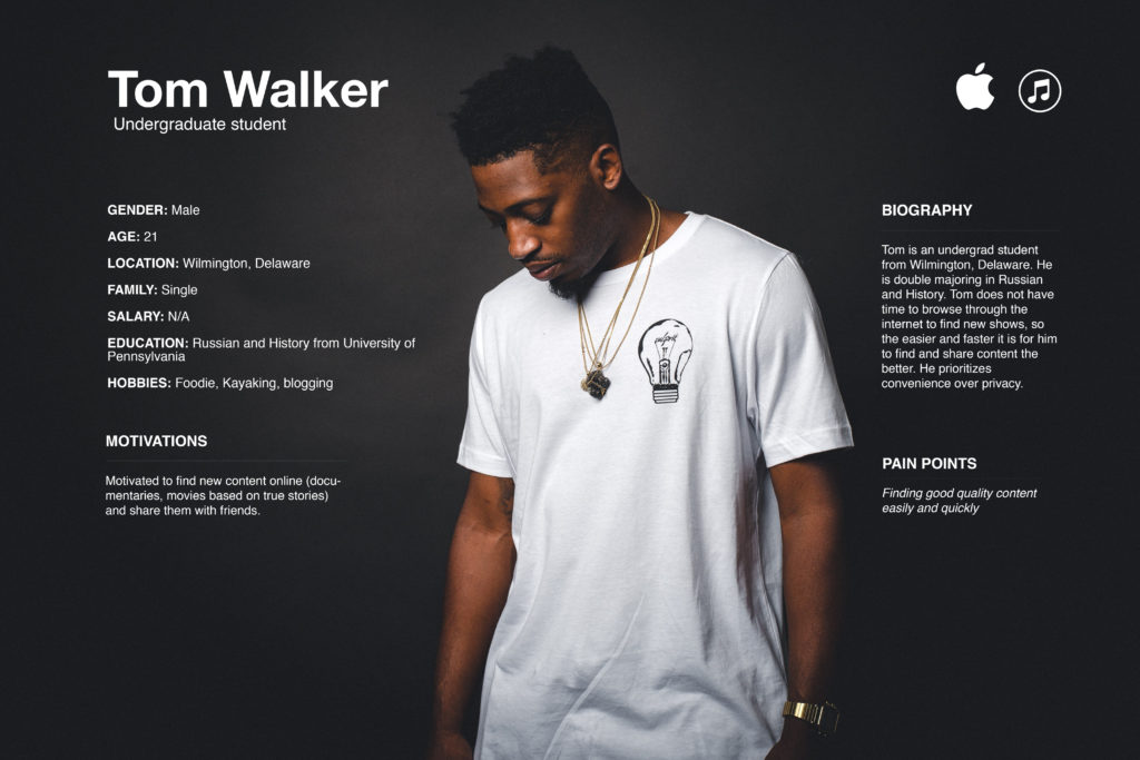
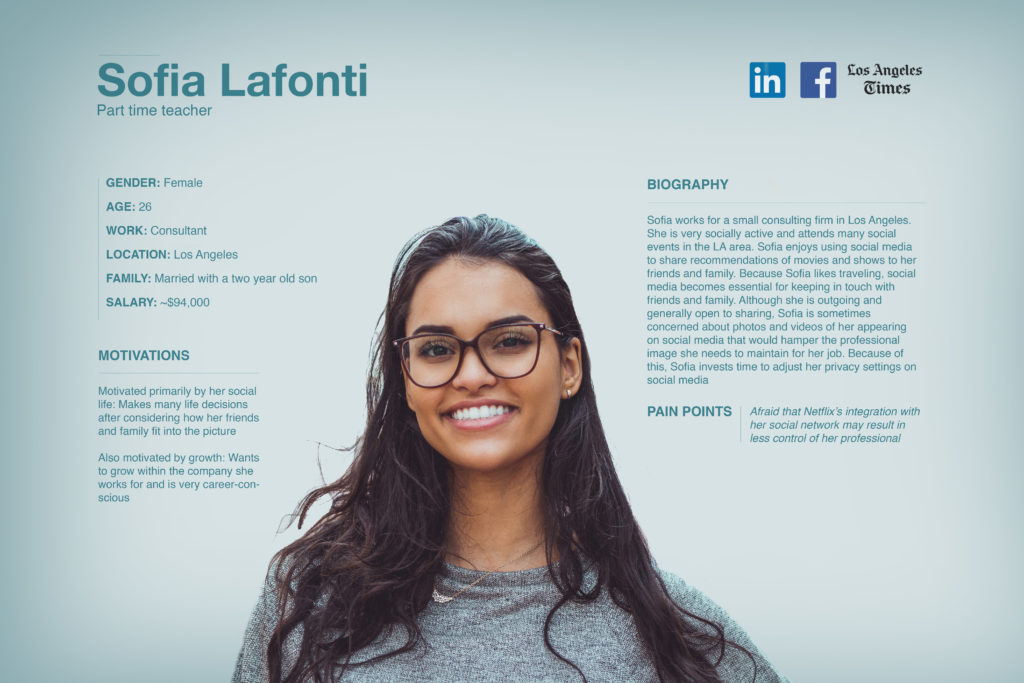
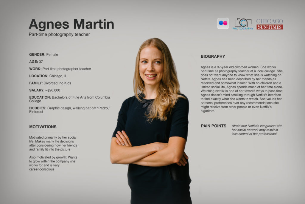
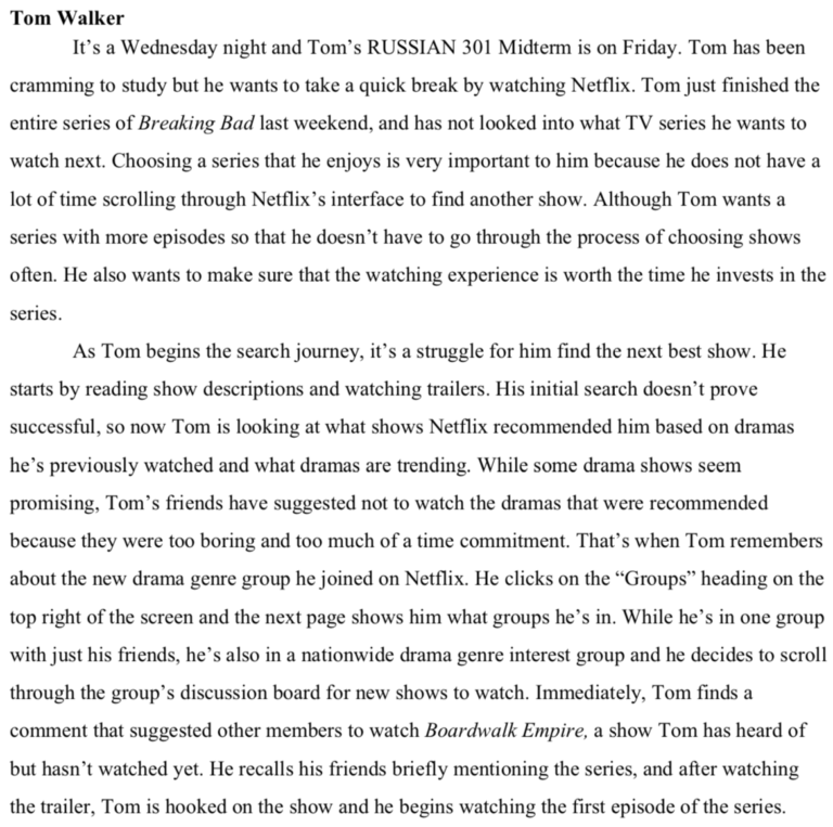
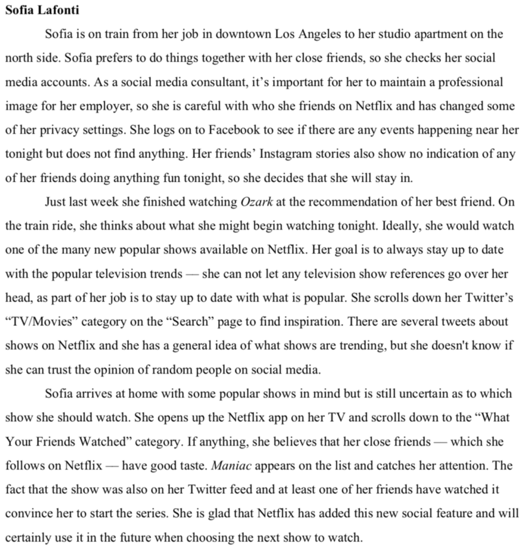
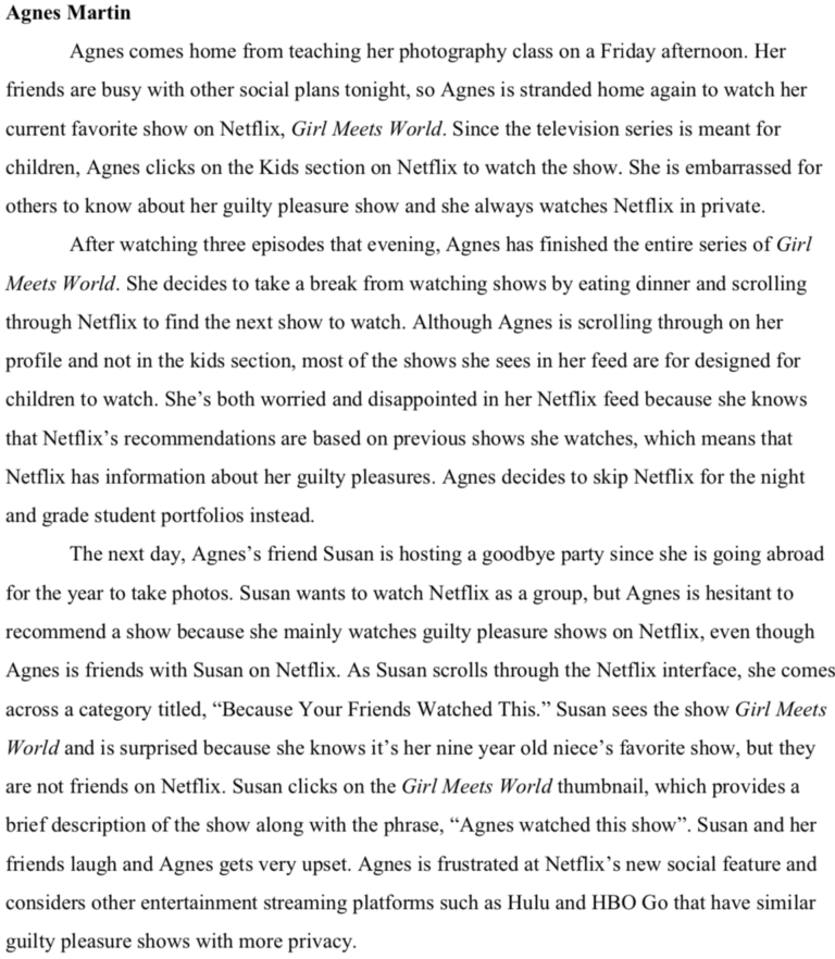
We used the range of sentiments and responses from our Interviews to develop three personas. Two primary personas were created along with one anti-persona. The primary personas have behaviors that support the proposed social features in some capacity, whereas the anti-persona has behaviors that inherently oppose the proposed features. The first primary persona is Tom Walker. Tom encapsulates the themes of a time-constrained, moderately-high sharing college student. His main concern is not privacy but rather convenience. For this reason, he hopes to quickly find a new show to watch at the cost of his privacy. Sofia Lafonti is the other primary persona. Sofia trusts her close social circle’s opinion and wants to stay in the loop with popular culture for her job. She uses social media but is concerned with her professional image. Therefore, she uses social features on Netflix to the extent that she’s able to maintain a respectable public image. The anti-persona is Agnes Martin. Agnes is a private person and likes her alone time. Moreover, time isn’t an issue for her, so she doesn’t mind scrolling through Netflix to find what she believes is a good show to watch. Her personal preferences outweigh the opinions of others. Therefore, she doesn’t like the social features on Netflix.
Affinity Mapping
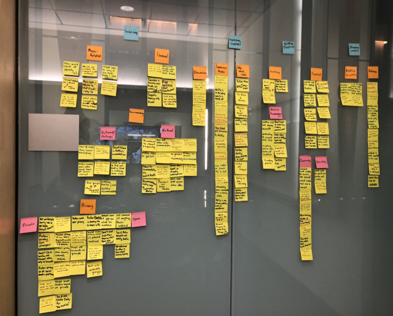
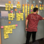
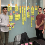
We conducted a workshop using an Affinity Diagram to surface important themes from our interviews and organize qualitative data into more manageable categories of information. The process of thinking through a coherent organization of our data helped us clarify areas of ambiguity within our data.
Scenarios
The scenarios portrayed situations in which a typical user might flourish or suffer by the social features. All of our scenarios kept the user goals in mind, for the personas wanted to find new shows, and conflicts such as time constraints, social reputation, and privacy blocked their path to reaching that goal.
FUNCTIONALITY
What design inconsistencies and usability problems arise in regard to Netflix’s user journey?
METHODOLOGY
While Netflix is a popular entertainment streaming platform, many attempts for more personalization and socialization have failed. In this section, I have analyzed what functions of Netflix need to be improved baby identifying flaws in the user’s journey and listing competitors that outperform Netflix in other parts of the personalization and socialization processes.

Heuristic Evaluation
A heuristic evaluation of Netflix will provide a hands-on approach to problem discovery and learning of its interface. This heuristic evaluation aggregates findings by navigating through a college student’s typical interactions with the site and taking screenshots where needed. Screenshots were assessed according to Nielsen’s ten heuristics and problems were documented where found. Based on the following criteria above, strengths or problems were found on Netflix’s site and severity ratings were provided for each heuristic. After organizing a list of severity rankings, the report summarizes priorities for which problems need to be addressed first.
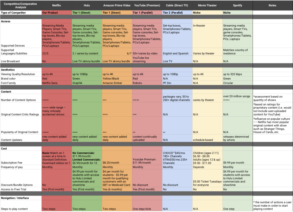
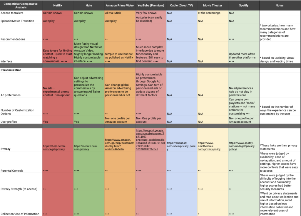
Competitive Analysis
With the competitive analysis, we wanted to learn about Netflix’s Tier I, Tier II, and Niche competitors and how Netflix can distinguish its product from the others. With 4K quality, wide range of critically acclaimed shows, ease of finding content, and number of customization options, Netflix performs better than its competitors in terms of aesthetics, content, navigation, and personalization. On the contrary, Netflix performed worse in access, cost, privacy, and social functionality because it lacks live broadcasting, offers no bundle options, discloses personal information to a variety of third-party companies, and blocks socially enabled features.
