Animal Uncrossing
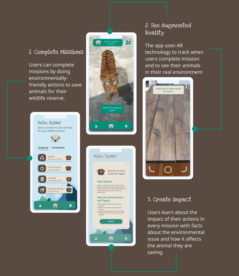
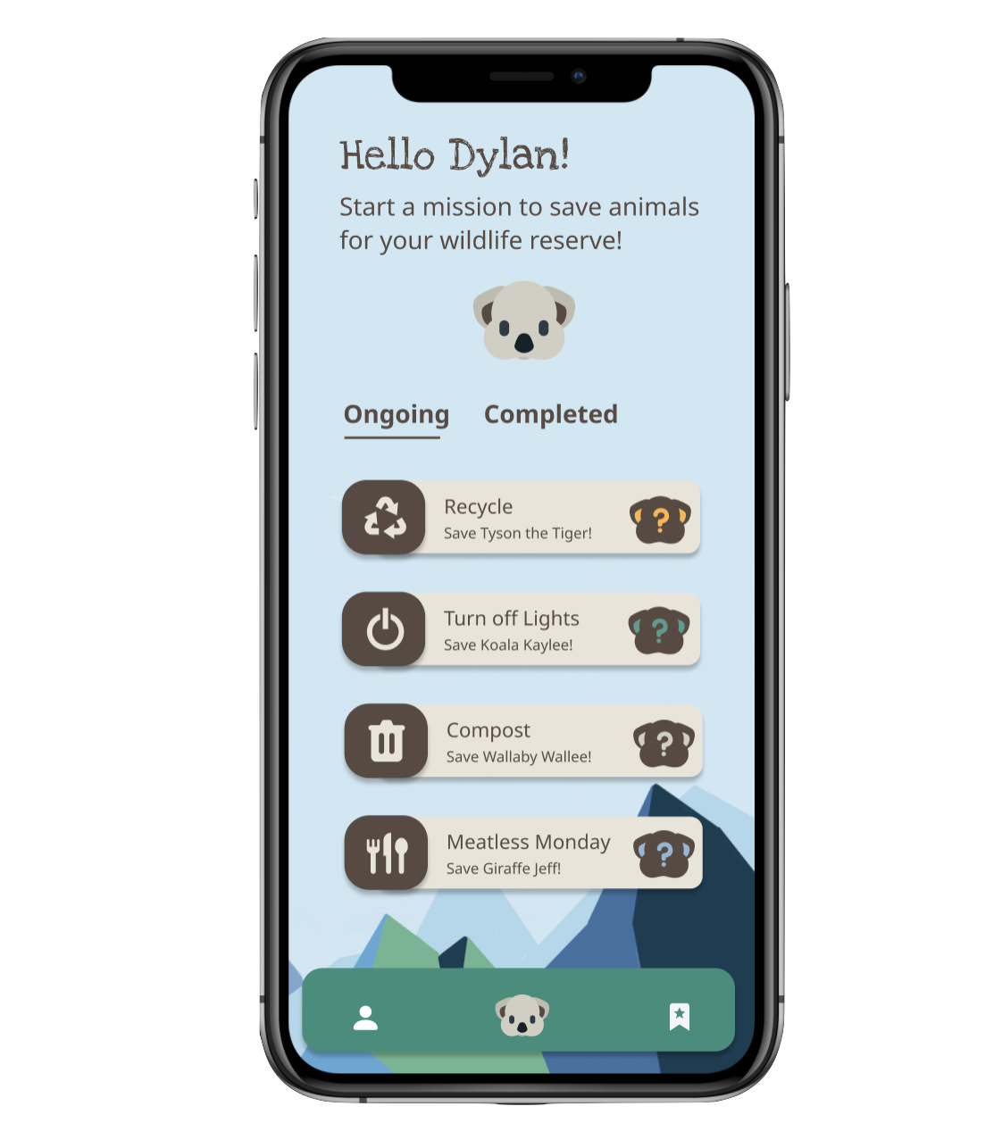
Animal Uncrossing is an Augmented Reality (AR) mobile game that allows users to create their own wildlife reserve by completing environmentally-friendly missions to save animals from extinction.
Overview
At a time where we face the threat of extinction for multiple species, how can museums, conservationists and technologists in Australia mobilize the power of the crowd and help alter the course of this ecological tragedy?
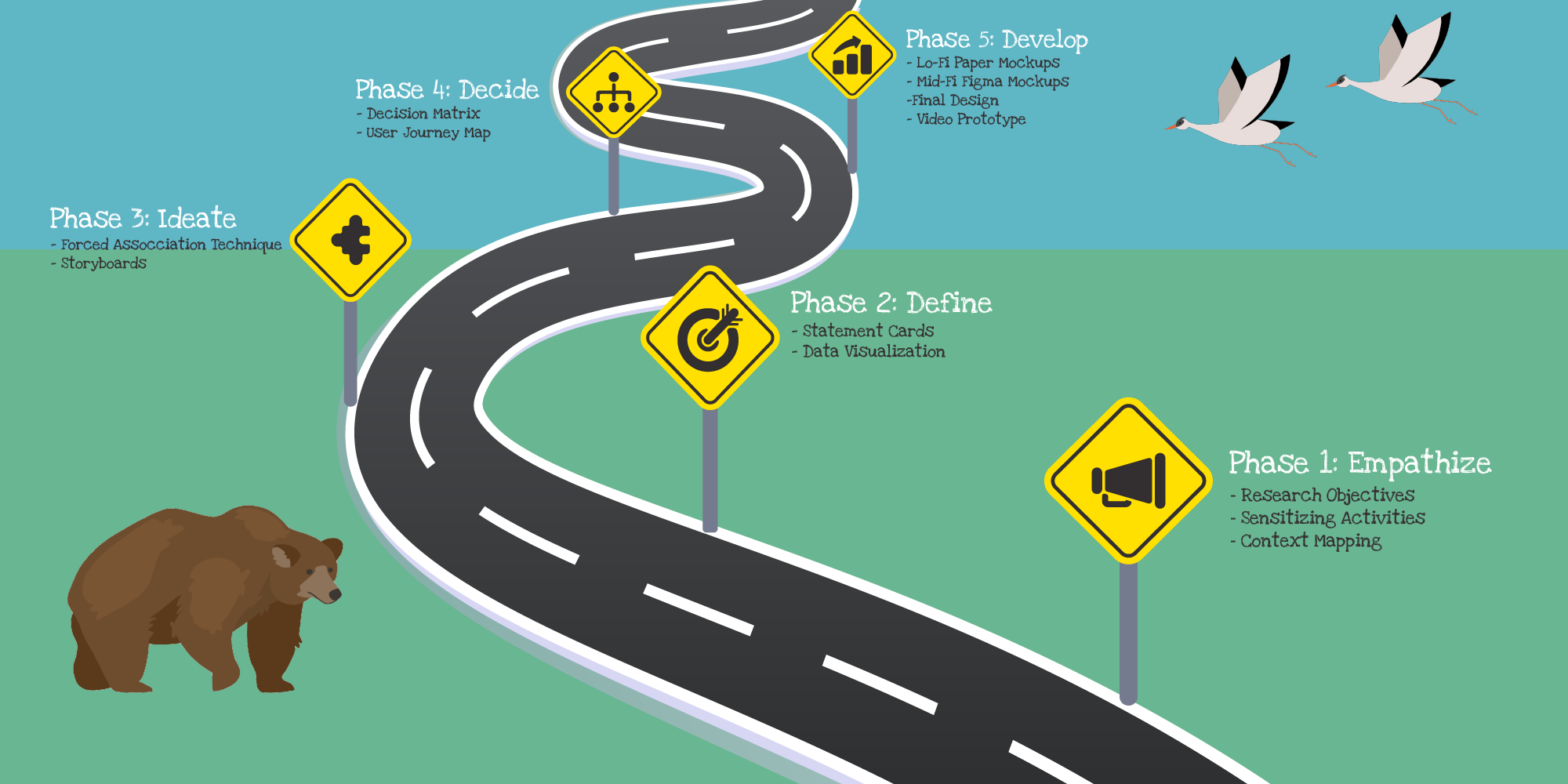
Design Roadmap
Phase 1: Empathize
Research Purpose:
Current extinction rates are 1,000 times higher than previously reviewed, which “Reinforces the urgency to conserve what is left and to try to reduce our impacts,” said Juriaan de Vos (2014), lead author of the team responsible for the new estimates. This ‘biological annihilation is what scientists are referring to as the “sixth mass extinction.” In order to gain a better understanding of these problems and its impact, we conducted in-person and Zoom sessions to discuss people’s opinions on the topic.
Research Objectives:
- Gauge awareness from others about the impact of their actions on other species
- Understand what factors make individuals motivated about reversing these ecological consequences.
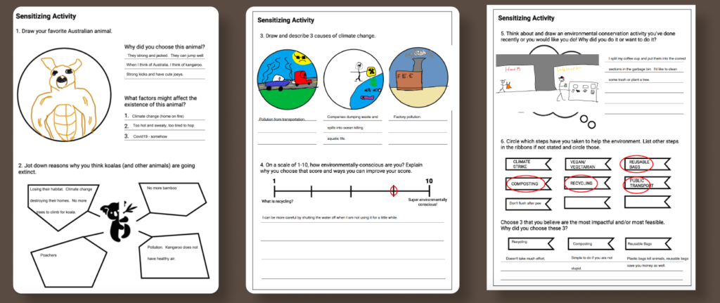
Sensitizing Activities
(Sent Before
Roundtable
Discussions):
We created a set of sensitizing activities with different prompts related to animal extinction, biodiversity, climate change, and preservation. We discovered that most of our users had limited knowledge about the topics at hand, but were open to learning more.
Context Mapping
(Created During Roundtable
Discussions):
After each user completed their sensitizing activity, we led them through a context mapping session, where the participants created a journey map of different relevant processes, such as “how to get others motivated for change”. Additionally, they worked on a series of collages by grouping the content based on their negative and positive associations. These context mapping activities were used to further gauge users’ perspectives on animal extinction.
Phase 2: Define
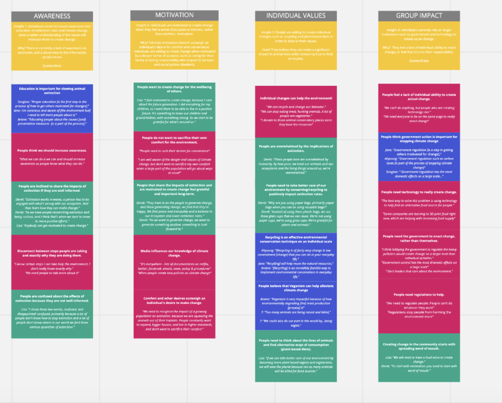
Statement Cards:
We used statement cards as a research method to narrow our prior findings. After multiple attempts at grouping, we used affinity diagramming to classify our findings under four main categories: 1) Awareness, 2) Motivation, 3) Individual Values, and 4) Group Impact. From reviewing these findings and insights as a team, we decided on a target segment and key area of focus for our vision statement.
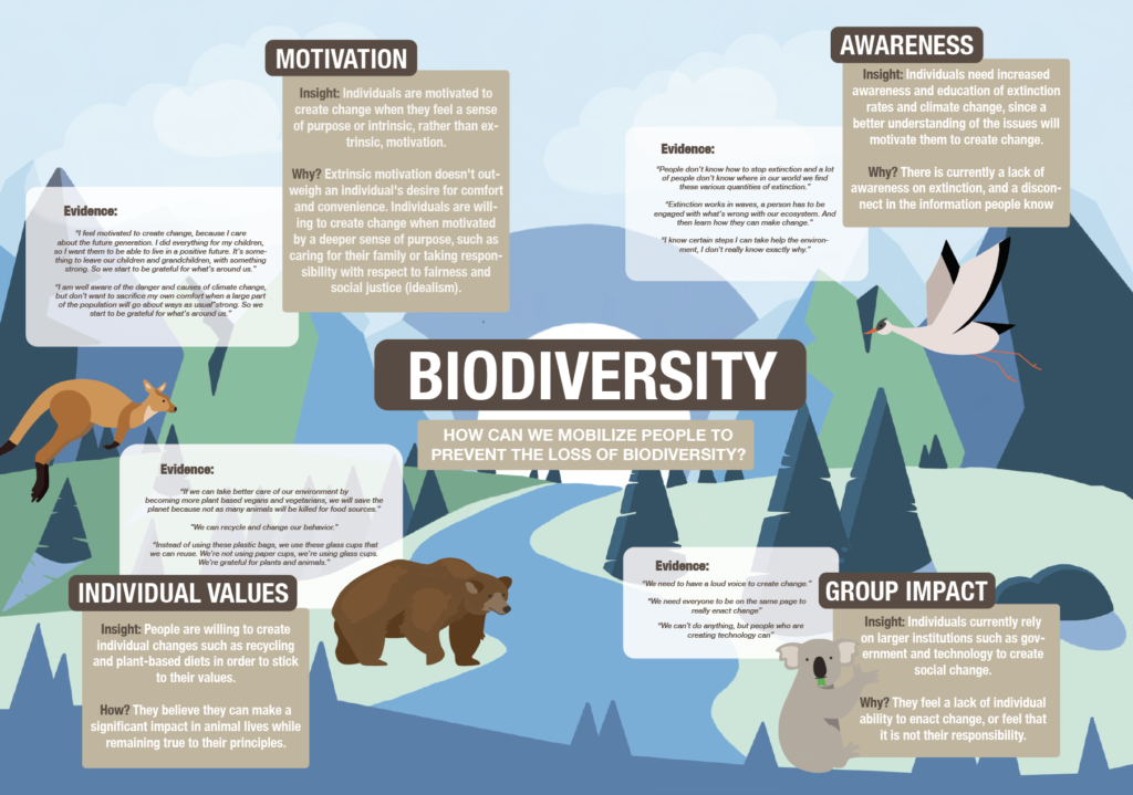
Data Visualization:
In order to more clearly display the insights from our user research, we created a qualitative data visualization of our key findings.
Phase 3: Ideate
Brainstorm:
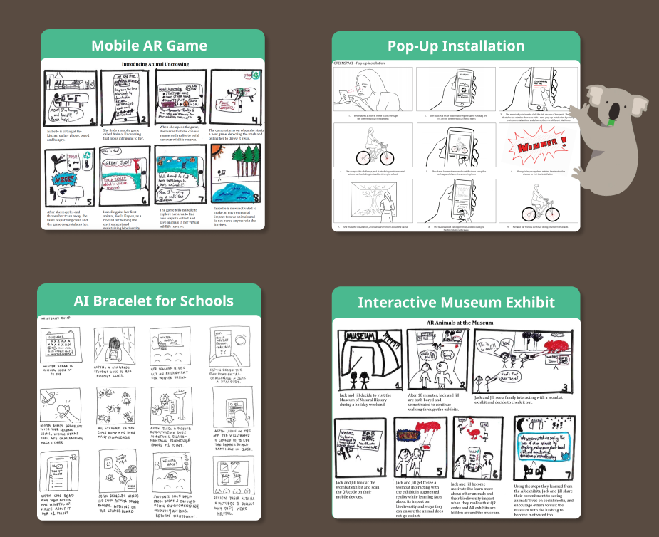
Once we formulated our vision, we began rapidly iterating ideas using the forced association technique. Essentially, we spent hours randomly combining emerging technologies with everyday objects until we discovered potential solutions. We were able to generate 4 potential ideas, including a mobile game with an AR overlay, a pop-up installation, and an AI bracelet, and a interactive museum exhibit.
Storyboards:
After our brainstorm, we created storyboards of the top four ideas we have in order to gain an understanding of the user flow and impact of each idea.
Phase 4: Decide
Decision Matrix:
To decide which idea would be the most feasible and effective, we created a Pugh Decision Matrix, comparing each of our ideas on feasibility, cost, accessibility, environmental impact, engagement level, and convenience. Since the AR mobile game received the highest score, we were ready to begin developing the concept. Inspired by the game Animal Crossing, we designed a mobile interaction where people received animals for their wildlife reserve when they completed environmentally friendly actions.
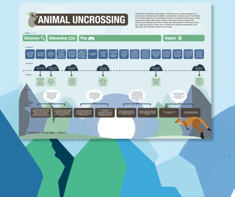
User Journey Map:
After we decided on the AR mobile game, we were able to map out the touchpoints, pain points, and solutions that our mobile AR game would provide using our storyboards.
Phase 5: Develop
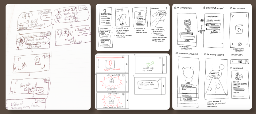
Lo-fi Mockups:
When we had a clear idea of the user flow from our user journey map, we started moving to prototyping through a set of low-fidelity paper prototypes that gave us a visual of the digital experience.
Mid-fi Mockups:
After we received valuable feedback from the idea (such as mission alerts and the option to start new missions), we felt comfortable moving to the design phase. We designed our own visions of mockups individually and came back together to identify what we liked best from each.
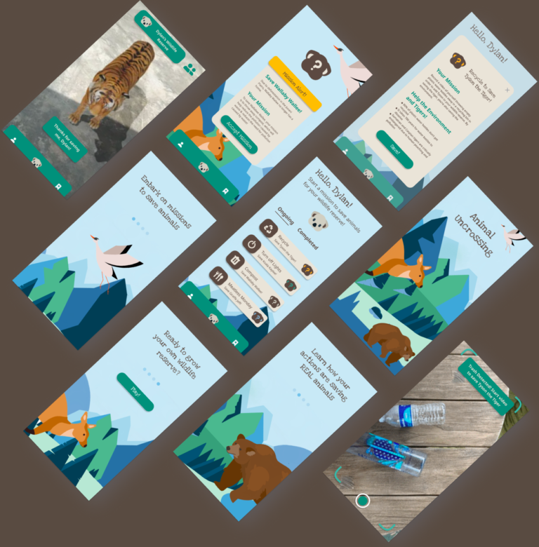
When discussing the pros and cons of these two designs, we decided that we wanted a final product that would be both elegant and playful. In our next iteration, we decided to combine the clean qualities of V1 and the more gamified approach of V2 to our high-fidelity, interactive prototype. We also decided that using the design assets of our data visualization and customer journey map would be the best outcome for a gamified approach to the high fidelity prototypes.

Final Design
Video Prototype:
Rather than generating a digital prototype in Figma, we created a video prototype that captures the digital experience and human interaction with the mobile AR game.
