WEBSITE INTERACTION DESIGN
Proudbox
For the Winter 2018 term, I was assigned by Michigan Advertising and Marketing (MAM) to consult the local startup Proudbox. Proudbox is a subscription-based college spirit gift box service for students at UM, MSU, and OSU. I worked with six other undergraduate students to expand Proudbox’s awareness and online brand.
Abstract
As a marketing analyst on the Proudbox team, I compared pageview hits and interactions on Proudbox’s websites and proposed strategies to improve social media marketing on Facebook, Instagram, and Twitter. Our team provided new designs of the website, logo, email blasts, and social media layouts. Other marketing strategies included holiday-themed boxes, back to school sweepstakes, and recruiting brand ambassadors. For the Fall 2018 term, I intend on redesigning the website to fit the needs of our users and to make the buying process easy, quick, and convenient for the customers.
The Beginning: Finding The Problem
Our goals during the first team meeting were centered around empathizing with the cofounder of ProudBox and understanding what customer needs and motivations for buying the product. By engaging with our client and its customers, we were interpreting strengths and weaknesses in the startup’s approach and defining core problems that our team could solve. We compiled a list of observations we found in the marketing process and prioritized problems in terms of severity and length of time needed to fix the problem. Here were the problems we focused on solving during the Winter 2018 term:
REBRANDING WAS NOT REPRESENTING ALL COLLEGES
ProudBox's original logo was green and white, and most of the information presented online was tailored to target one school at a time, which was unnecessary.
SOCIAL MEDIA FEEDS DID ATTRACT TARGET MARKET
Many of the posts on Instagram, Facebook, and Twitter were not targeting college students and online content/email blasts was not aesthetically pleasing.
WEBSITE WAS UNCLEAR AND NOT WELCOMING
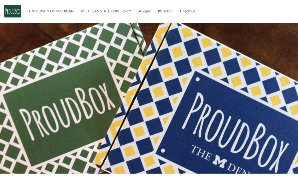
Two different websites for the same product led to more confusion for customers and lack of tabs added difficulty to finding information about the product.
My Focus: The Website
During the semester, I decided to concentrate my efforts in improving ProudBox’s website. Although the e-commerce on the website was efficient and the user had control over the visibility of the website, the problems of the website outweighed the benefits and therefore we set the website as a priority for refining. Major concerns of the website include the lack of pictures of the product, which led to a minimalist design, the confusion of where to find more information about the product due to the tabs, and the overcomplicated procedure of finding the frequently asked questions of the product. I brainstormed five recommendations for enhancing the website.
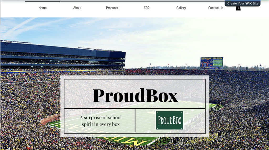
Rather than separating the schools on the drop down menu, we want to give the new website more specific and recognizable tab names, such as ‘About Us’, ‘FAQ’, and ‘Gallery’.
Since many people do not actually know what the subscription-based box is, we want to enhance the ‘About Us’ section to give them a better sense of what the product is.
ProudBox is a college-spirited product, so the startup should intend to post as many photos of the product as possible so to immediately grab the attention of the customers to the product.
The social media icons were hard on find on the website, so we hope to make them more accessible to the user by including them on the homepage.
Various links on the old website, such as the privacy policy and terms and conditions, brought the user back to the homepage instead of the intended webpage.
In addition to these recommendations, I suggested a website design of ProudBox’s website. The startup had hosted two different websites for the same purpose, so I thought it would be best to start from scratch using Wix. The background of the website could also serve as a slideshow to display all the photos of the product to pique interest.

