Interface: Mobile-first with Tablet and Desktop views
Tools: Microsoft Visual Studio Code, Web Validators (Wave, W3, and aXe)
For this project, I designed and developed a website for my Winter 2020 study abroad experience at the University of Sydney in Australia. When brainstorming ideas for the site, I wanted a five-page website (homepage, academics, surfing, food, and trips) that prioritizes responsive design, accessibility, and design choices that reminded me of my experience (such as the kangaroo hopping landing page and polaroid collage photo albums). For this documentation, I go into detail about my design process and demonstrations of responsive design choices, uses of CSS frameworks such as grid and flexbox, and steps taken to address diversity, inclusion, and accessibility.
Design Choices
Responsive Design Media Queries: To ensure that I created a responsive website, I decided on a mobile-first layout with 2 media queries – one for the tablet view (greater than 600 pixels) and one for the desktop view (greater than 768 pixels). With each view, I incorporated unique changes that would make the site easier to use.
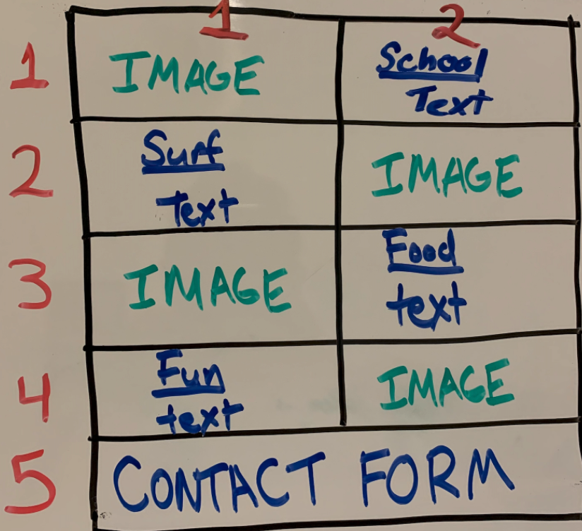
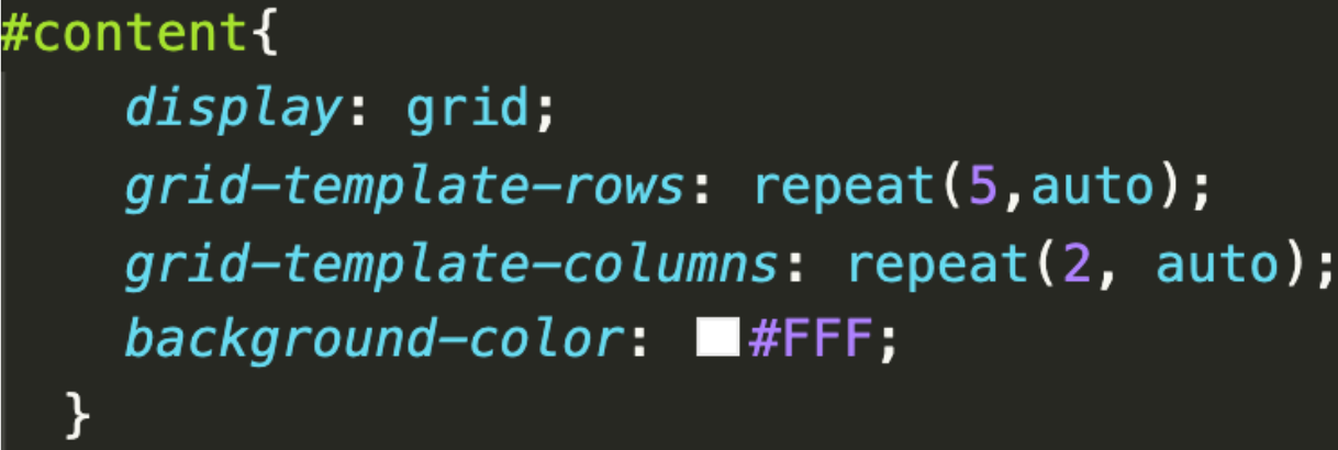
CSS – Grid: To avoid using floats to position elements, I converted the block layout on the mobile view to use a grid-based layout on the homepage for the desktop and tablet views. I created five rows and two columns, where I was able to alternate images and text for page snippets, and have the last row be the contact form.
Another instance of grid was for the food page. I used grid in this instance to optimize the responsiveness of my site – I have 1 column of images for the mobile view, 2 columns of text for the tablet view, and 3 columns of images for the desktop view.
CSS – Flexbox: To create a more responsive webpage, I also used a flexbox framework for images on the school and surf pages. Flexbox was convenient for these images because it is an effective way to distribute images within an undefined, dynamic container. I used a row wrap flex flow to ensure that images wrap around the page as the width of the view changes.
Diversity, Inclusion, and Accessibility
Throughout the design and development process, I wanted to take steps to ensure that people with disabilities (such as color blindness and dyslexia) and alternative devices were able to understand and enjoy my website. It was important for me to understand that accessibility can be helpful for temporary situations, such as someone breaking his / her arm and not able to move the mouse around. Below is a list of functional changes I made to my website to meet the POUR (perceivable, operable, understandable, and robust) requirements for accessible design.
Responsivity: 3 media queries based on size of screen (as mentioned above)
Prefers Reduced-Motion Media Query: A media query for animations to be removed if the user made a preference for a reduced-motion display on his/her device.
Hierarchy: Using scale and size to express importance, and using whitespace around elements to make them stand out
Color Contrast: Following WCAG 2.0 level AA guidelines, which requires a contrast ratio of at least 4.5:1 for normal text and 3:1 for large text.
Color Blindness Checker: Downloaded Sim Daltonism, a color blindness simulator for Mac, to view websites from Deuteranopia (red-green confusion), Tritanopia (yellow-blue confusion), monochromacy, and partial monochromacy, subsequently making a few color changes to buttons to meet the needs of these perspectives.
Alternative Text Usage: Provided alt text for all images