Level Up and Explore the World with Zonder

A digital travel companion that adds gamification to users’ travel experiences, allowing them to “collect” locations and tour, compare, and explore different travel experiences with a journal-like functionality.

Zonder iPhone Mockup

Overview

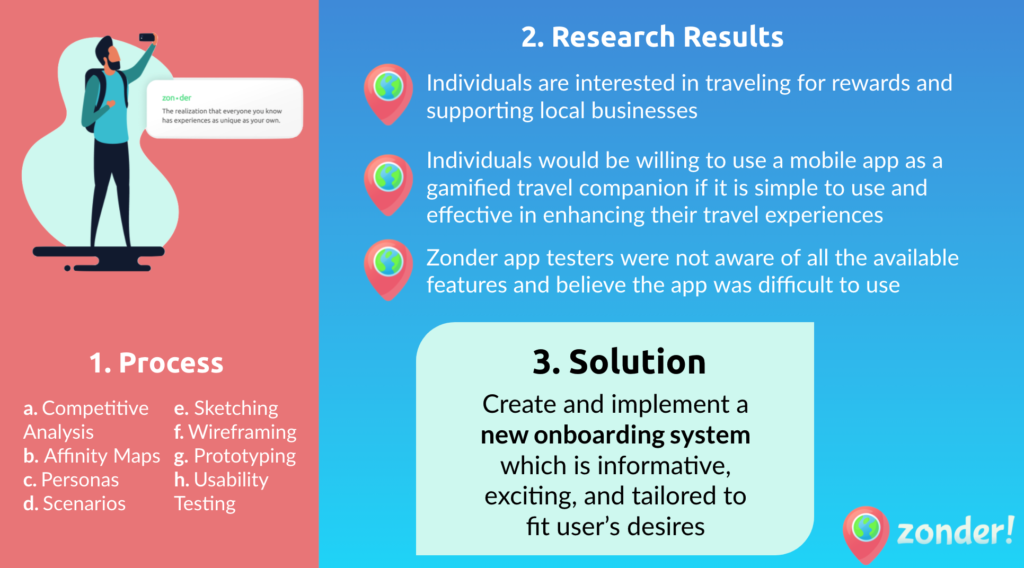
Class: BSI UX Capstone (SI 487)
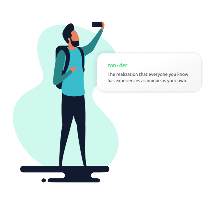
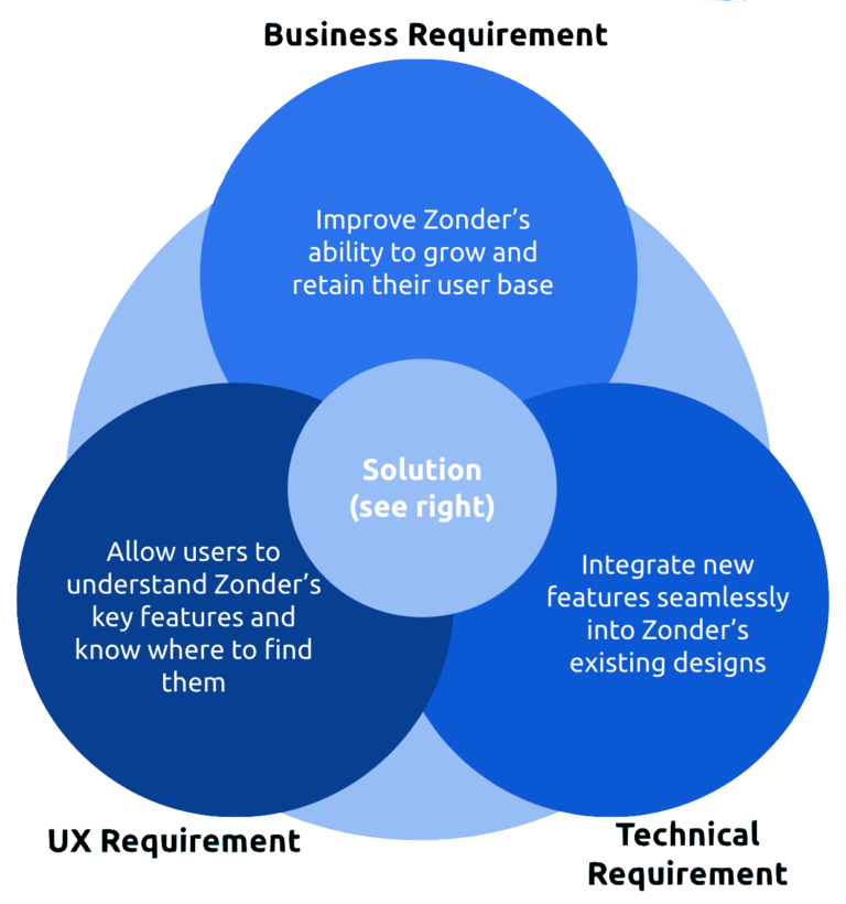
ObjectiveTo improve acquisition and retention of Zonder’s gamified traveling app while preparing for a post-Covid-19 travel spree and UX relaunch”
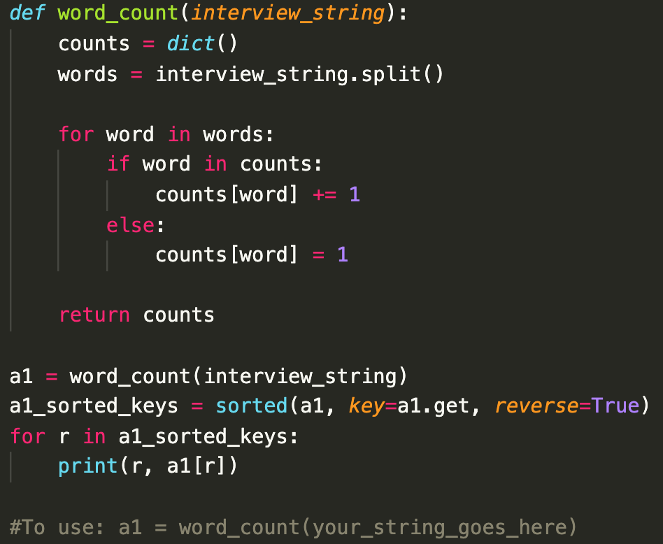
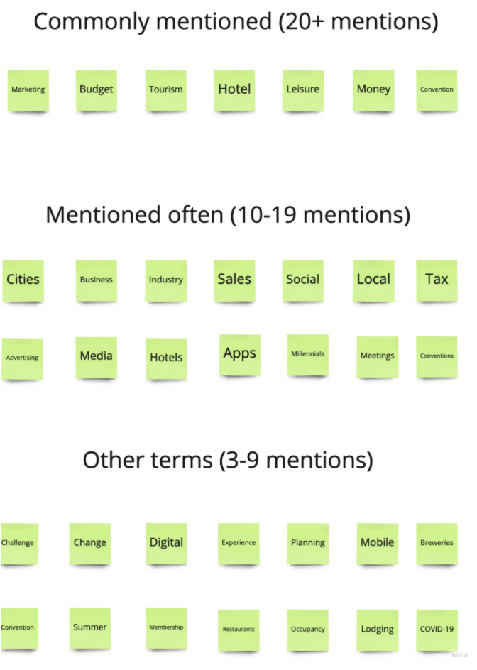
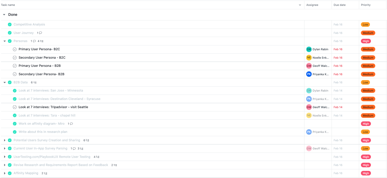
Skills: User Research, Metric Tracking, Feature Prioritization, Relationship Management, UX Design (wireframing/prototyping), Remote User Testing, Python
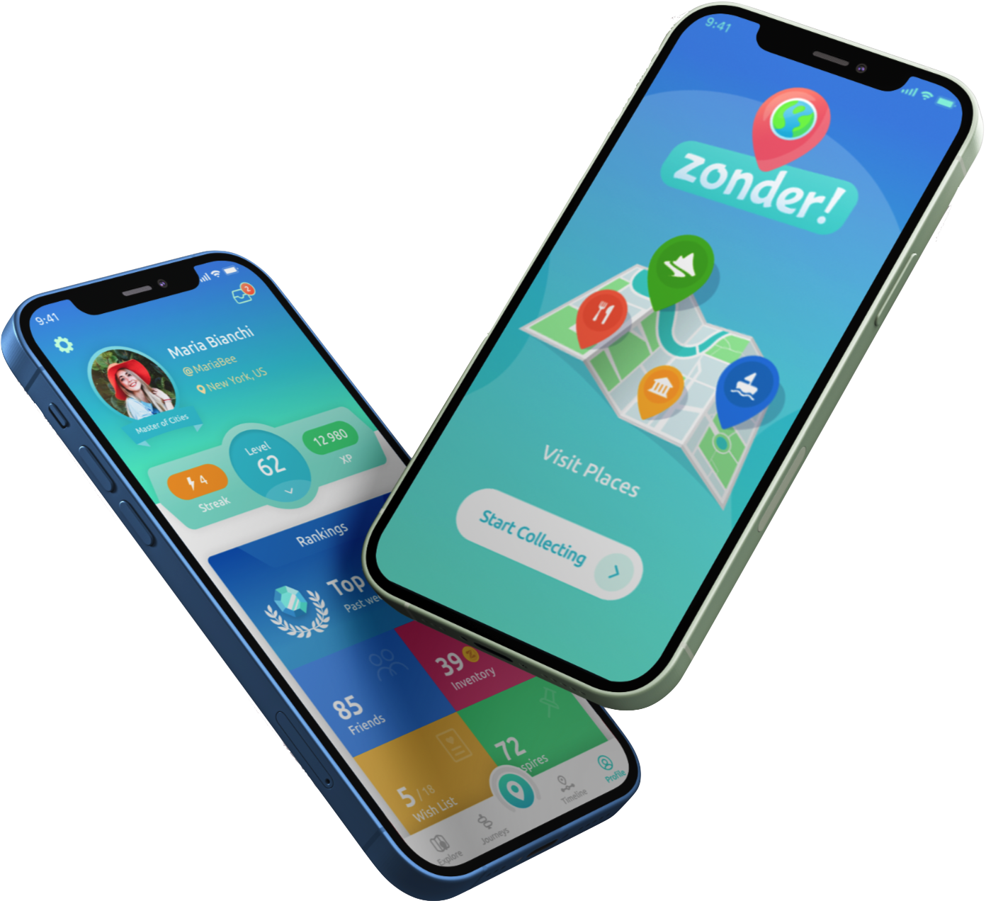
Interface: iPhone and Android Mobile App
Tools: Asana, Discord, Miro, Mixpanel, Figma
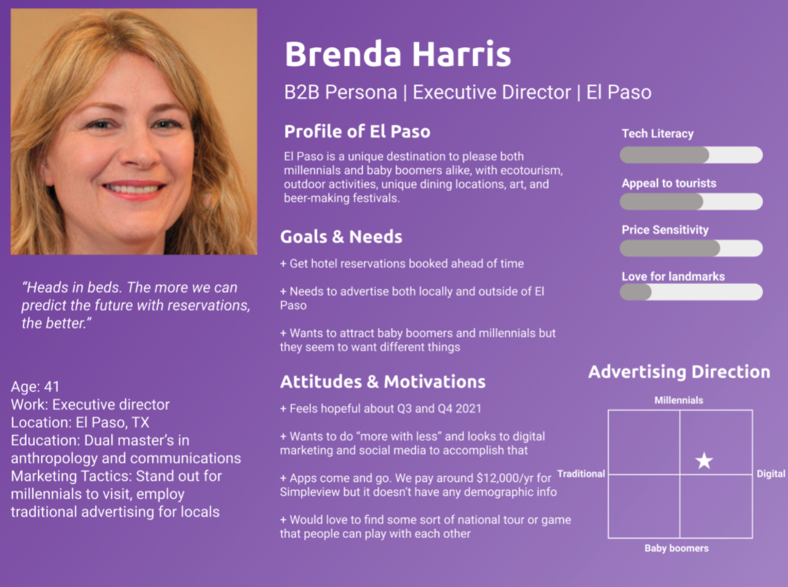
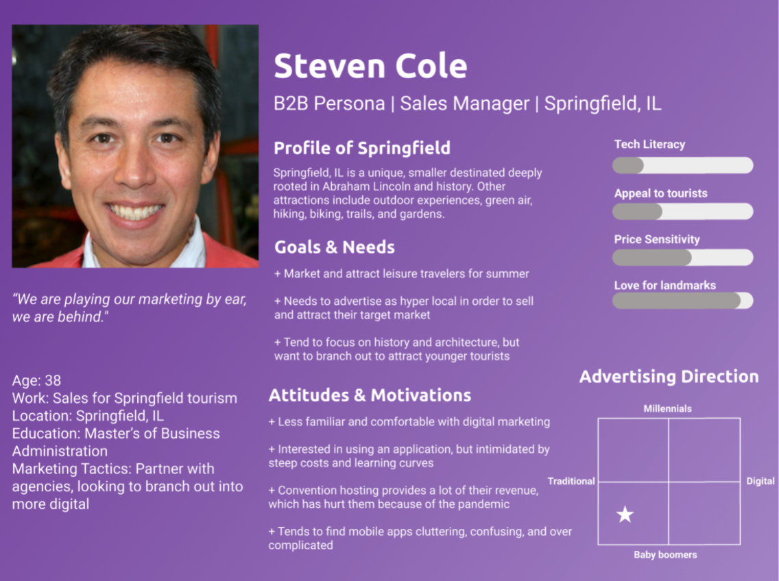
Contributors: Myself, Noelle Enkema, Priyanka Khetarpal, Geoff Walchak
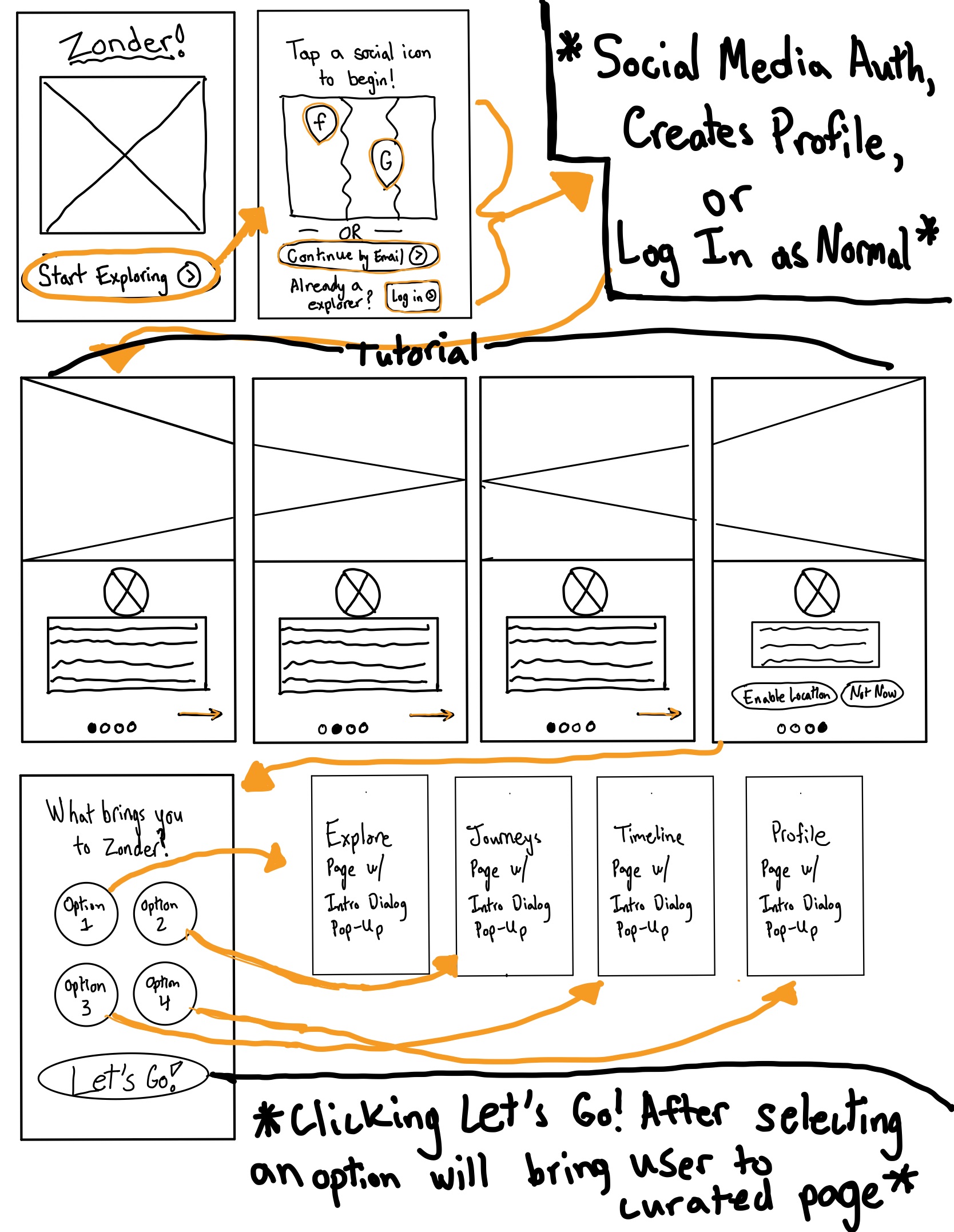
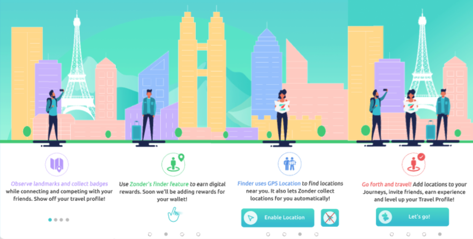
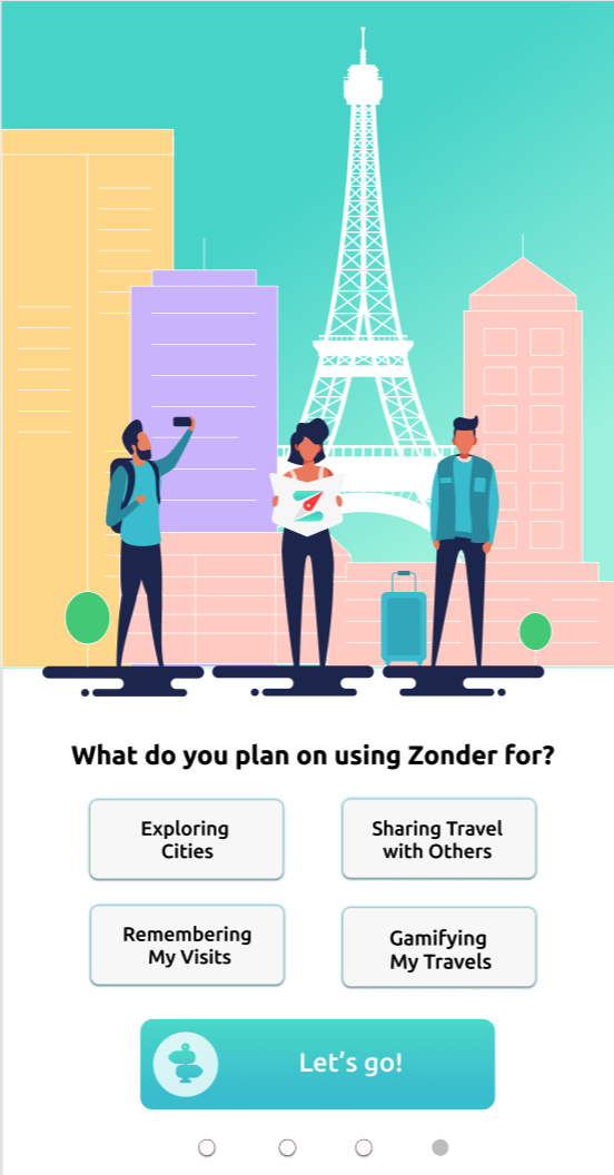
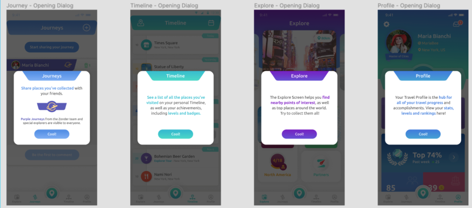
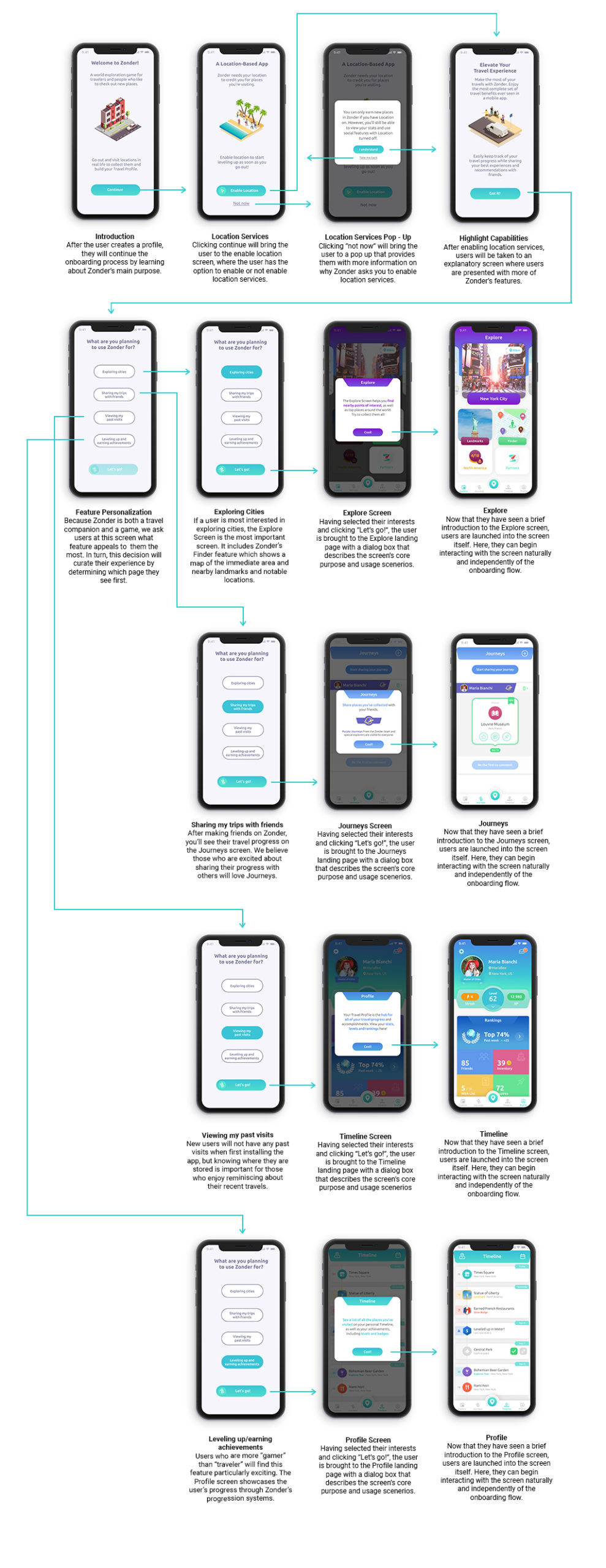
Scan this QR code for an interactive prototype of the redesigned onboarding process!
Zonder Meaning

About Zonder

Zonder is a digital travel app that keeps track of your experiences and rewards you for exploring new places around the world.

Objectives

The Zonder team wants their app to be an all-in-one travel app where users choose what features they can use. As a result, Zonder will be able to generate revenue through in-app purchases and B2B partner contributions. Outlined here are three goals for growth:

Zonder Map

Increase acquisition of potential users by 10%

Zonder Person

Improve retention by converting visitors into users

Zonder Virus

Prepare for a post-COVID relaunch with an UX audit and redesign

Project Plan Gantt Chart

Research

Based on client feedback, market research, and the work done during the first three months of the class, our team carried out the following four research methods:

Competitive Analysis

Zonder Competitive Analysis
Click the image to see the full analysis in a separate window

We compared Zonder to 2 direct and 2 indirect competitors, listing their key features, popularity, ratings, and monetization. Information pertaining to each app was pulled from the Apple app store, Google search, and user-generated content on blogs and social media. 

Surveying Potential Users through Peer Network

The design of the survey was intended to capture overarching themes and behaviors in potential customers’ habits and desires when it comes to travel documentation and experiences. We received 185 responses by sending the survey on Facebook, Reddit, GroupMe, email lists, and other social media outlets.

B2B Interviews with Tourism Board Leaders

Zonder presented the UMSI team 28 interview transcripts with potential business partnerships within their ecosystems. Zonder found the stakeholders through internet searches, utilizing personal networks, and browsing LinkedIn. The UMSI team synthesized each transcript for valuable insights.

Remote Usability Testing via PlaybookUX

The UMSI team connected with the leaders at PlaybookUX to administer 4 unmoderated usability tests of Zonder’s current app interface. These users from PlaybookUX’s panel were unfamiliar with the app, providing a fresh perspective on the usability and comprehension of Zonder.

Define

By conducting UX research on the current market segment and app usability, we were able to find valuable insights that became actionable task items. The insights are presented B2C and B2B affinity maps, personas and scenarios; a Python script; and usability testing results/evaluation. 

Business-to-Consumer (B2C) Affinity Map, Personas, and Scenarios

The information from the B2C affinity map came from the potential new user survey. The answers from the question: “What is your biggest problem when documenting travel?” were compiled together and presented as common pain points for potential users. Additionally, answers from the question: “Are there any features missing in current travel documentation apps?” became quotes for ideas in the affinity map. Pain points, summarized below, were incorporated into the B2C personas, and some ideas were mentioned in the B2C scenario.

Business-to-Business (B2B) Affinity Map, Personas, and Scenarios

The B2B affinity map pulled data and quotes from the B2B interviews with members of various tourism boards. The UMSI team broke the affinity map into quotes (yellow sticky notes), themes (pink sticky notes), and categories (orange and blue sticky notes). The analysis from the B2B affinity map and 2 personas are pictured below:

Python Script & Visual

The Python script scanned each of the B2B interviews in a .txt file and gathered all of the most commonly spoken words with the amount of times they were spoken. This method revealed the frequency of different topics and used quantitative data to make observations about what matters most to the stakeholders.

Usability Test Results

During the PlaybookUX usability testing interviews, each participant’s phone screen was filmed and a text transcript was included. The team was able to tag common themes and issues from a usability perspective. The insights, important quotes, and next steps are compiled below for analysis:

*Quick Note About Prioritization*

Our team utilized Asana to track progress for our UX research deliverables. With a quick turnaround for research (~1 week), we prioritized our deliverables based on the Priority level (pictured) and the T-shirt size (not pictured).

Design

Solution

Create and implement a new onboarding system which is informative, exciting, and tailored to fit user’s desires

Design Process

Brainstorm and Low-Fidelity Sketches

Our team began by hiding all previous mockups and gave each other 30 minutes to design Zonder’s onboarding process from scratch. After 30 minutes, we uploaded our designs in a Figma file and compared results. We each starred our favorite ideas and presented those ideas to our client. After reviewing the ideas, our began with low-fidelity sketches, which are pictured below. 

Main Redesigned Features

Personalized Homepage

One of the most prominent changes is the personalized homepage featured. At the end of onboarding, users will be asked what excites them the most about using Zonder, and based on their answer, the user will start their adventure at a different homepage.

Opening Dialog
Pop-Ups

When a user is brought to a new screen of the app, a pop-up will explain the purpose of the screen and tell the user what actions they can complete with that feature. This was added based on the results of remote user testing.

Emphasizing Location Services 

Also as a result of user testing, we decided to emphasize the importance of enabling location services. We prompted the user in onboarding to enable location services and brought them to another screen to ensure they knew what limitations there would be if location services was off.

Medium-Fidelity Mockups

Once our team received approval to move to medium-fidelity mockups, we began converting our ideas into Figma screens by using Zonder’s design assets.

Round 1 Testing

Our first round of testing included 4 peer participants, a standup with the Zonder client team, and a class standup. Here are three changes we made in the refinement phase.

Decrease Tutorial Cognitive Load

Interactive tooltips option became the fourth screen, consolidating to decrease user load

More Importance on Location

Made the enable location services screen available after the first swipe to emphasize its importance

Maintain Style guide Consistency

Redesigned square buttons to oval buttons to maintain consistency with Zonder’s style guide

Refinement

As we were about to finalize our designs for the refinement phase, the CEO of Zonder told our team that they were replacing the design team. We decided to pivot from the outdated graphics and attempt to use a mimialistic style with isometric graphics. Below are the revised visual designs for the onboarding system in an interaction flow diagram.

Evaluation A/B Testing

After another thorough iteration of designs, our team wanted to test whether the redesign improved the general understanding and appreciation of Zonder. With consideration of the three project goals, our team conducted A/B testing, where A was the original prototype and B was the redesigned prototype. We tested 12 participants, asking them 3 quiz questions and 3 opinionated questions (Net Promoter Score, knowledge level, excitement level) each. Correct answers received 1 point, incorrect received 0 points for Research Question 1. Scores for Research Question 2 were on a scale from 1-10, where 1 was the worst and 10 was the best. Seen below, a type 2 t-test showed statistically significant results that the redesigned prototype improved accuracy for understanding Zonder’s capabilities. 

Preparation & Final Designs

Final Designs Zonder Slides

Final Week & Poster Exposition

The last week of our projects included presentations, poster exhibitions, and a handoff of our work to the client. Our posterboard is included below, along with a screenshot of the exposition through GatherTown!

Poster Board Zonder
Click this image to see the poster deck!
Close Menu